For the past six years, the Google Play store logo has remained unchanged. But finally, the search giant decided
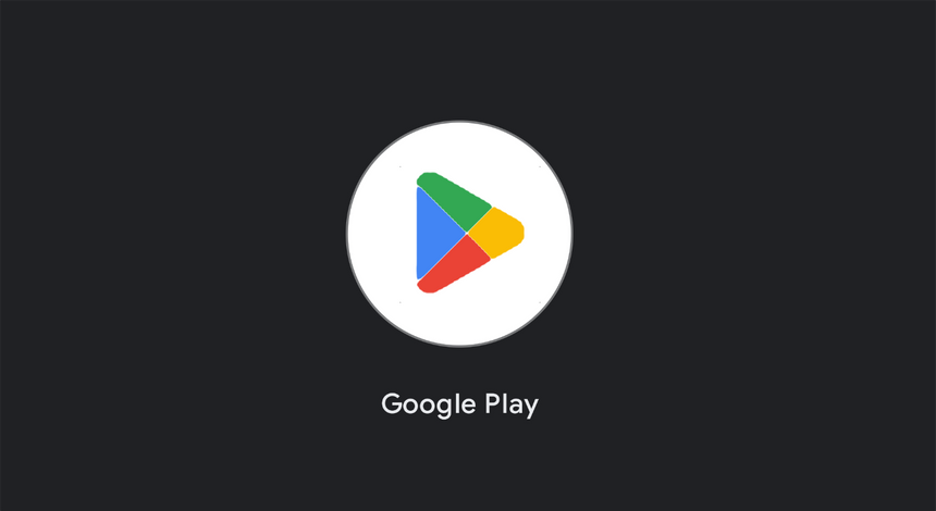
It should be noted right away that the new version of the logo does not have fundamental differences from its predecessor. It uses all the same colors, just darker and more eye-catching.
Also, the new Google Play icon has more rounded corners. Interestingly, it now looks more like that in Xiaomi's proprietary shell - MIUI.
Recall that a couple of weeks ago, the FAS Russiasaw signs of abuse of dominance in Google's actions. All due to the fact that the search giant prohibits developers from using third-party payment systems in paid applications that are hosted on Google Play.