The Bagaar design team has launched a website that can be classified as a tool for
Register as a feat
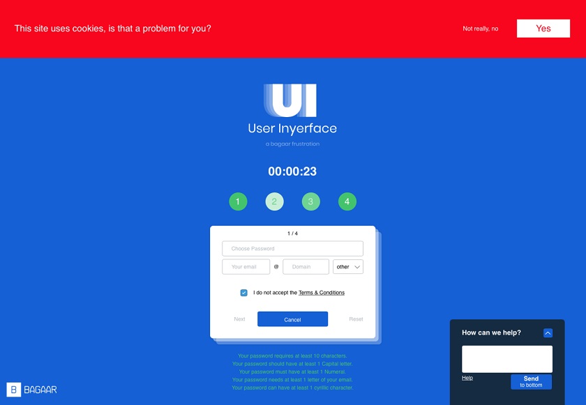
Website userinyerface.com is designed like a game where everything is designed to confuse you. The goal is simple - go through the hell of a crooked interface and register for a time. All buttons, icons, navigation and colors here are made contrary to established rules: four password requirements written in light green on a blue background, black and white country icons, a constantly popping up timer and much more. Everything is so bad and funny that it’s even brilliant.
“Over the past ten years we have become accustomed tocertain design patterns: positions, colors, icons. Users act intuitively, taking 90% of the interface for granted. But what happens if you mix everything well? What if we move away from the established rules and do the opposite?” say the developers
</ img>

</ img>

</ img>