Why is it difficult for beginners at the start
Weak visual acuity
Often novice specialists
Experience "in a vacuum"-beginners did not face real challenges
Few realize that the purpose of a designer is to decidebusiness request, and not just create a beautiful design layout in Figma. Therefore, only specialists who have entered the profession, instead of solving the problem, draw a beautiful picture. This "transition" from beauty to functionality is not easy, but it is very important for growth in the profession. In fact, this is one of the main difficulties at the start of a designer's career.
Every year the requirements for a specialist are growing.
The set of basic skills is already voluminous, and to itrelated ones are also added - knowledge in product analytics, development, animation, and so on. It is very difficult to develop them on your own, you almost always need a leader or mentor.
Additional difficulties are created by high competition and often unrealistic requests from companies: many are looking for professionals for junior salaries.
4 beginner mistakes and how to deal with them
There are several "gaps" that almost all novice designers have. But they can be easily dealt with if you notice in your work.
1. See work as art.It is not uncommon for beginners to think they are artists andthey do the wrong thing: they check the indents between blocks of text, select colors for hours and try to build a composition according to the golden ratio. All this is almost inapplicable to interface design. The area is not just called Human Interface Design, it is very applied: here it is important to design an interface for a person to work with a computer, website or application and, first of all, think about how convenient and easy it will be to use the product. Here's the best advice: think function first, aesthetics second.
2.Complicate the interface and decorate with unnecessary elements.Beginning designers often try to addmore icons, graphics and other “decorations” in a complex interface. In such cases, there is a good rule: the less design, the better. A minimal set of elements is beneficial for both the designer and the future user. The first one will cope with the task easier and faster, and the second one will reduce the time to resolve the request. Here you should remember about the main metric - Time on Task.
3.Produce extra screens and actions for the user.The motto of many newbies is:“Complicated means for professionals.” Because of this, they deliberately make some steps difficult to show how much they can do. For the same reason, you can see the websites of restaurants and cafes that design the digital menu in the same way as the usual one directly in the establishment. Everywhere they add painted backgrounds, animated pictures and banners, which overload the page and distract from the main thing. For example, a phone number by which a client can reserve a table and pay for dinner is almost impossible to find.
4. Not seeing the overall picture of the process.Beginners try not to leave their comfort zone andthink only in terms of the task at hand. They lose a sense of scale and fail to connect their part of the work with the overall goal of the project. Because of this, situations arise when a designer creates a cool solution that simplifies registration from three steps to two, but then the site redirects the user to the most complicated settings screen: from this, the entire effect of the improvement disappears. In order to notice such errors in time, you need to be able to communicate with other departments: development, marketing, business. The designer can draw their attention to the problem and offer a solution that goes beyond “design the registration”. It is important to always feel the scale of the changes that the designer makes to the product.
Life hacks: how to create a cool interface
Focus on UX-user experience.The designer's product, first of all, should be simple and understandable. Therefore, when developing a design, you should always think about the client and the goal he wants to achieve.
It is important to understand that each site has goals andThe applications are completely different, so it is worth considering the context of the future design. For example, the registration steps for flight booking and food delivery apps will be different. A specialist must have empathy for the user in order to always think about him and imagine how he will work with the product.
Clear UI-the way the site or application looks.A good interface is always made with attention toto a specific user. Since the concept of “user-friendly interface” is different for everyone, the designer needs to separate the target audience from the rest and figure out exactly how it will be more convenient for them to use the product.
This approach allows you to create interfaces that are truly understandable for a specific audience with certain expectations from the product.
Simplicity is also welcome here. Therefore, if you don’t know at all how to make the interface, use the principle “so that my grandmother understands”. It works in any incomprehensible situation.
Conduct corridor interviews and test the interface. It is impossible to accurately calculate how muchthe product will be relevant, so it is better to start development small and only then add new features. This way you can launch a product quickly and develop it, taking into account the needs of the target audience as much as possible.
Let's take design development as an example.for Generated Photos, a service that generates photos of faces based on artificial intelligence. The first version of the product was deliberately designed as a stock photo portal with a large set of filters: you could choose skin color, hair, race.
The fact is that the original audience wasa small group of enthusiasts and companies that develop artificial intelligence. For them, technical details and the ability to accurately filter the results are very important. Therefore, only after this stage, when the hypothesis was confirmed and the product really turned out to be in demand, they began to test other use cases and take into account a wider audience. For example, we added the issue of similar photos.
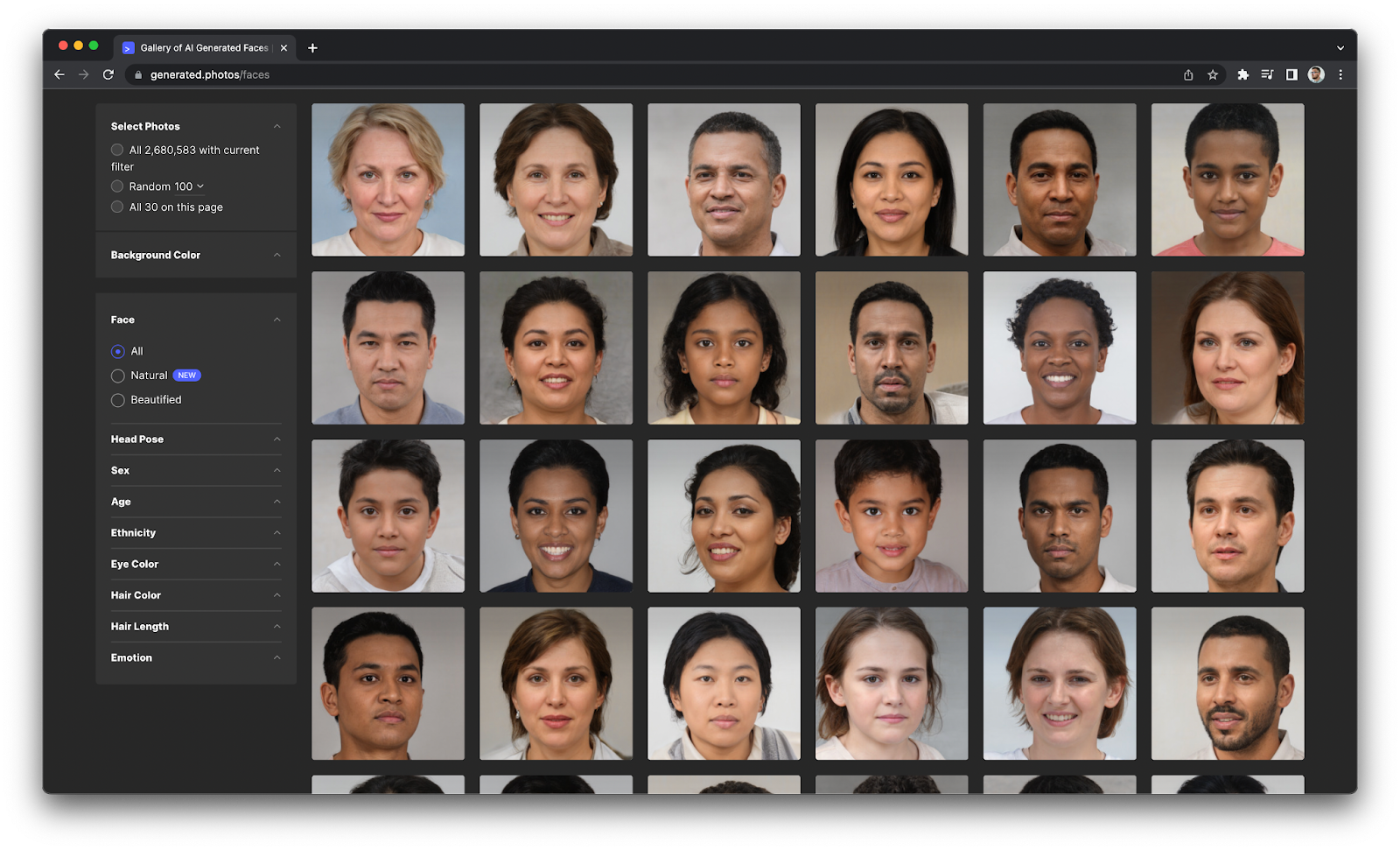 Catalog of photos with filters / Generated Photos, 2022
Also started adding features that are usefuldirectly for the development company. Since the generation of faces by artificial intelligence is an experimental thing, I wanted to teach it to make fewer mistakes and unnatural photographs. The cheapest solution, which turned out to be very useful: add a like and a dislike to each photo so that users evaluate how well the photo was made. Many people turned it into a game where they hunted for poorly generated photos and disliked them. The neural network learned from these assessments and gradually became better.
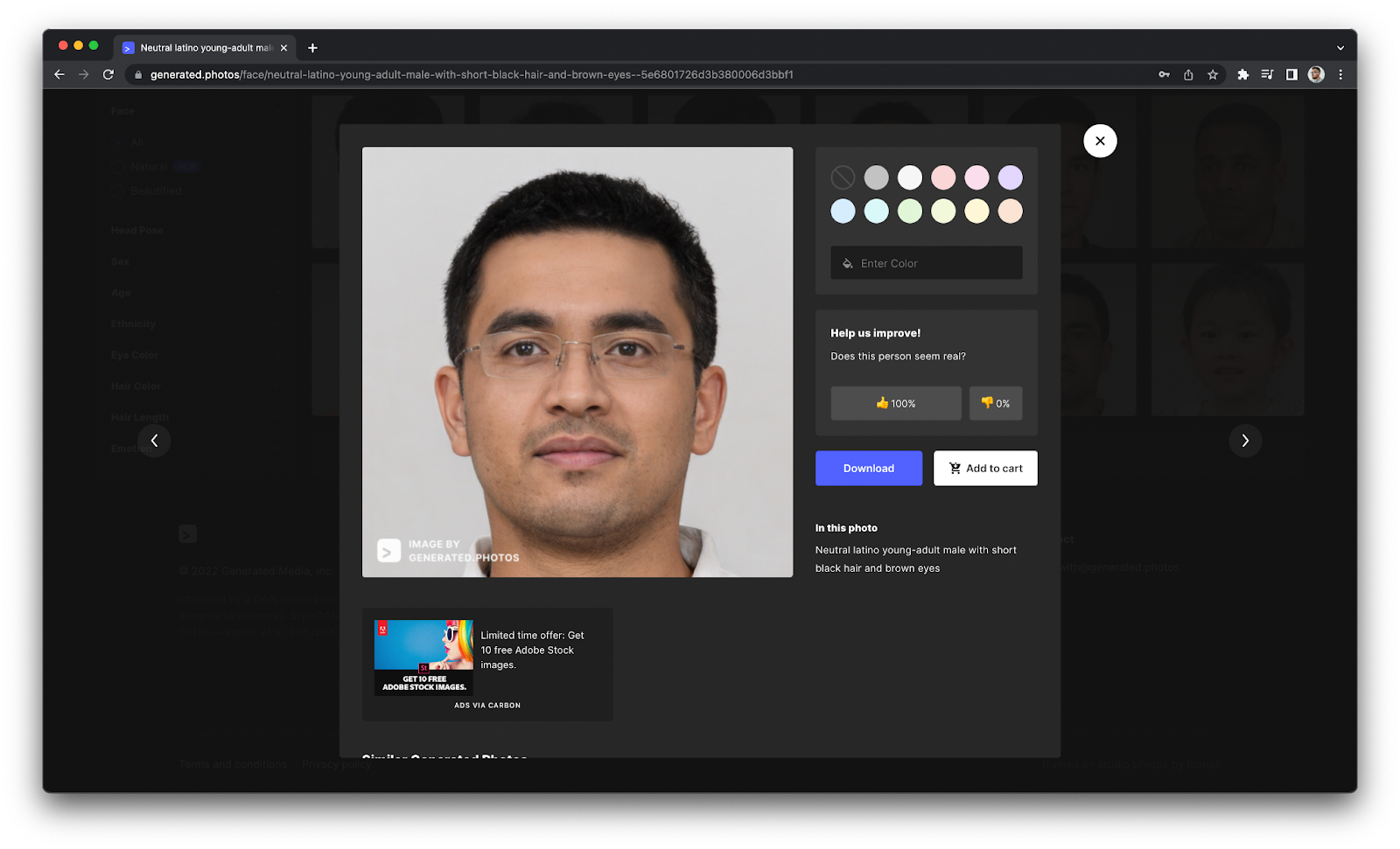 Widget for rating a generated photo (right) / Generated Photos, 2022
It might seem that adding such things mightonly a product manager, developer, or analyst, but a good designer does this just as often. It is very important for him to understand the audience and the product, turn on empathy and imagine how you can do better for the customer and the consumer at the same time.
Use a design system to create a product quickly and efficiently.If you work for a company that has severalproducts and services, an excellent solution would be to bring all design elements to the same style. This is an obvious idea, but it is not always given enough attention. Why does the user need to retrain the brain every time to find the necessary elements? Why does a designer need to think through new visual UX solutions every time? They can be unified so that the client always knows what to expect when starting to use another company service. In the West, this has a capacious term from the psychology of perception - affordance, which means “expected destination.”

 Unified navigation, search, account management and filters / Icons, Ouch, Moose (by Icons8), 2022
This reduces the same Time on Task, simplifieslife of the user, as it is easier for him to move from one service to another, and also helps the business to launch new products faster, bypassing the long stage of development from scratch.
Mistakes and difficulties happen to beginners in anysphere, but getting started is easier when you know them in advance. These recommendations will help professionals see their gaps and climb the professional ladder faster.
Read more:
Created a quantum computer that "went beyond the binary system"
The supersonic plane will fly at a speed of 2,000 km/h and cross the ocean in 3.5 hours
A compelling new theory emerges as to why the Mayan civilization collapsed