The Chinese company Meizu intends to change its logo for the third time in the company's history. First time she did it

New Meizu logo

Logo "Tasty - and that's it"
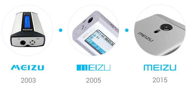
Former and current Meizu logos
© Ilya Nerybov.
According to Weibo
The Chinese company Meizu intends to change its logo for the third time in the company's history. First time she did it
New Meizu logo
Logo "Tasty - and that's it"
Former and current Meizu logos
© Ilya Nerybov.
According to Weibo