The Finnish company Nokia, founded in the mid-19th century, has changed the legendary logo.This is the first time this has happened
What is known
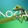
Nokia came to Barcelona for Mobile World Congress 2023. The company announced plans to focus on "aggressive growth". The new logo has become an expression of "dynamic, energetic and modern Nokia".

</ img>
The logo consists of five shapes, which together form the word NOKIA.Sites will crop the logo with square thumbnails, which will remind their visitors that 0<1.
Nokia CEO Pekka LundmarkLundmark) in an interview with Reuters called the key stages of the company's strategy. It's reloading, speeding up and scaling. The first stage has been successfully completed.
</ img>
</ img>
The changes are dictated by the company's desire to get away from the association with phones, because it is no longer engaged in their production. This business has been owned by HMD Global for several years.
Nokia management wants to launch a new brand,which will focus on networks and industrial digitalization. The company will try to increase the share of wireless services with network equipment and sell private 5G networks to customers. In 2022, corporate sales grew by 21% and received an 8% share (€2.11 billion).