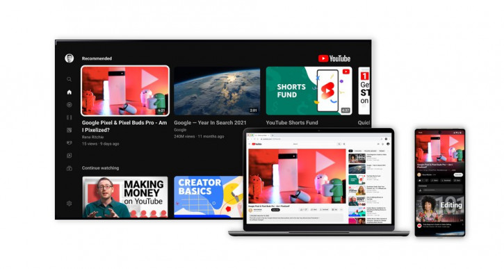
YouTube has come a long way since 2005, but in recent years Google has increasingly
First, now dark themes for mobile andThe PC versions of YouTube are equipped with an ambient mode, essentially reminiscent of the Ambilight backlight on Philips TVs - the area around the video window is dynamically illuminated with colors, as if emitted by the video being played. By the way, the dark mode itself has become even darker.
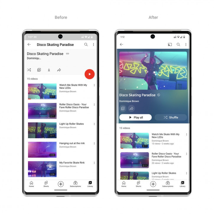
Secondly, the playlist interface has been redesigned,which now adapts to the color palette of the covers, but also takes up a good half of the usable screen space. Thirdly, the “Like”, “Share” buttons. and “Download” have also been redesigned, becoming more compact, and the “Subscribe” from red it turned into white and moved to the right corner of the screen - supposedly it’s easier to find it there.
Another innovation was the gesture“pinch” to scale the video like a photo in a gallery. In addition, rewind on mobile devices now has a preview area, making it easier to find the desired fragment. There’s also a double-tap gesture that allows you to quickly skip a chapter of a video.
© Vladimir Kovalev.
Sourced from blog.youtube